Going on the point I made just before, I went back and looked at what I had written oh so long ago, back when this used to be the dke project, all the way back on friendlygrocer :)
The first thing I picked up on was that my designs overall have probably been slipping :) Back then, each page, each post was carefully crafted by hand, for without script-enabled hosting, what other method is there? And the other thing was that it wasn’t just a blog, it was a whole personal site, and that’s something that going down the blogging platform path takes away from you, I think. It does make a lot of other things a helluva lot easier (no need to FTP in every update, for one).
Here’s the second design (the first being no design :D) –
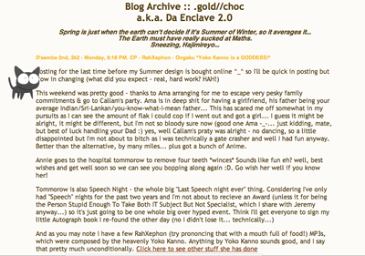
I had a splash screen! It was all the rage then, as I recall… Maybe just as I recall. But I like splash screens, dammit. I can’t find my v2 splash screen, but the hit parade below should be a nice little walk through my design history (thumbnails only, mostly for my sake). You may note an anime-ish theme running through the earlier designs.
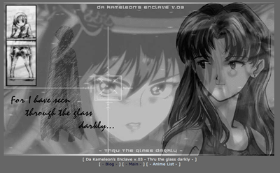
Through the Glass Darkly
I used image smileys in this one
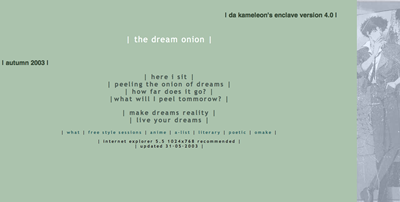
the dream onion – my first go at poetry (!)
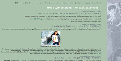
“the freestyle sessions” was the name of blog section
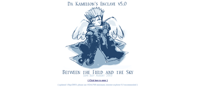
Between the Field and the Sky
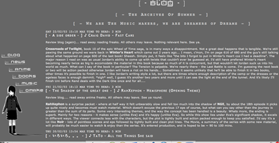
Hello iframes!
Did I mention how torturous the writing is on this blog? God, I hope this stuff isn’t preserved in the web archive or somesuch.
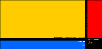
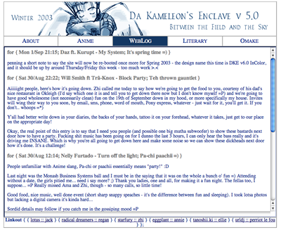
In Colour
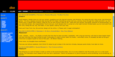
The iframe had a yellow scrollbar in Internet Explorer
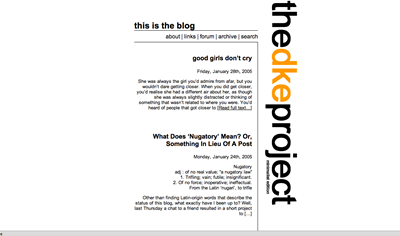
I particularly liked that last one, despite it being all kinds of horrible on the eyes, especially so at night (when I did most of my blogging). It adhered clearly to my principles of expressive design without the need for images to be spliced around. If you can’t design something with just pure HTML/CSS, you’re not really trying =P
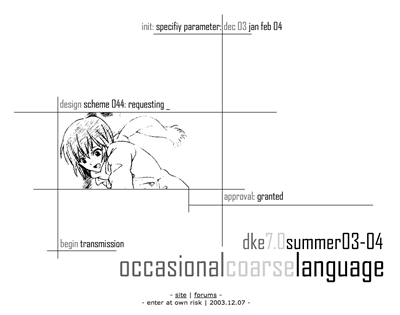
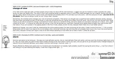
occasional coarse language
This one is also one of my favourites
And version 7 (also a fav) was the last of the Mohicans hand-crafted designs. I was off to India at the end of 2003, and I wanted a way to be able to update without having to deal with FTP, and I found a solution. I’d long wanted to play with dynamic web languages (mostly PHP), and WordPress fit the bill (free, fairly hackable, PHP/MySQL). It also let me put a forum up and pretend that my site was some sort of hub for my bunch of friends =) Ah, the innocence of youth.
WordPress was very much in its infancy then, at version 0.72, though it was already growing and showing promise. There was no independent theme structure in those days, so the easiest way I found to plug it into my existing blog was to simply i-frame in the core loop, some straightforward CSS in place to make it all square. It worked seamlessly! =)
More designs followed yet – at the time, I’d been in lockstep with a few others, changing designs every season, and I had to keep the designs flowing. Version 8 can only be described as lazy, with no excuses (“old skool/the official lie”). Version 9, “Codename Eternity” (Winter 04), was an attempt at something vaguely Sci-fi themed.
(The unfortunate part of the early wordpress infrastructure is that themes weren’t seperable from the implementation, and this means that while I have the designs on file, it’d take a bunch of needless effort to try to revive it =P)
Version 10, “Occam’s Razor” (Spring 04), broke the seasonal mould – it continued past spring, mainly because I liked it so much. Initially supposed to be far more concept-based, a revolving door of images along a theme that was easily skinnable. This only happened once, for Christmas – suffice to say, the lack of a digital camera wasn’t helpful.
This came very close to running into the new year.
Version 11, codenamed “I/O” was a non-starter. Between working and hosting issues, my design never progressed beyond some prototype images and I ended up ditching it for Michael Heilmann’s funky new theme, K2, a sterling example of how a theme should be constructed but also an example of how a project can run away on you (development is still on going).
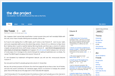
Version 12 was far more pragmatic a redesign, adding a third column of my own design to give a wide-body blog that was moving towards a kottke-esque link blog.
I was halfway through a new design (which would crop up again later, mutated) when Jeremy (friendlygrocer man) told me he was going to change things up, and dropped the hint that if I would care to move on…
Everything was going to be excerpts!
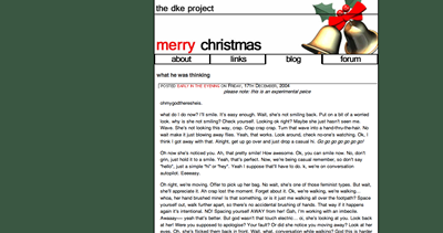
Thus the first rumbling of my own domain started around this point, and thus was the dke project retired for pushing the sky.
Heh, I’ve forgotten about most of these but I recognize every one of these designs except for maybe the very first one. I think WordPress has really held you back design-wise.
me too :(
nah, I think it’s mostly the structure of “blogging”, as opposed to a site-with-a-blog. a blog site almost enforces the column of text, while the site concept allows a little more freedom to play. Haven’t really had a proper think-though about what I want to do with this place though.