A preview of Mac OS X 10.7 Lion for me at the Apple Store today, before I go and upgrade:
- Arrrrrrrrrgh, Apple, did you really have to implement rubber-band scrolling in Mac OS X too? It makes sense, kinda, on an iPhone to show “there is no more to scroll”, where you potentially might have your finger over the scrolling indicator. On Mac OS X, I want that to stop scrolling and stay.
- “natural scrolling” (i.e. what the rest of the world calls “inverse scrolling”) is… surprisingly easy to get used to, actually. Though that said, I can only imagine the hoops the muscle memory will have to jump through when flicking between systems that follow that convention and those that don’t.
- Thank you for setting scrollbars visible to be an option at least.
- Thank you (finally!) for any-edge-of-the-window resize.
- Not so much a fan of full-screen apps, unfortunately. The full-screen button is not a substitute for the Maximise icon in Windows.
- While full-screen mode is nice, and I can see the point here, some (many) are apt to lose the damn window if you’re doing this quaint notion called multitasking. Alt-… err, Command-tabbing away to another app works when going from a full-screen app; to go back, you have to use Mission Control/Spaces.
- Speaking of which, Mission Control is surprisingly good – better than Expose/Spaces by a long shot. I hate that spaces is now limited to a in-a-row configuration, but otherwise MC wins comprehensively.
- In the same vein, Launchpad is pretty and decently usable too, for the right people. I tended to keep the Applications folder in the dock to show as a grid for my parents to launch apps on the Mac; Launchpad is a better/cleaner interface for the same thing, and easily ties into the iPad halo effect.
- On the other hand… click-and-hold to get apps “wiggling”? It was for right-click that tap-and-hold was created to substitute, not the other way around.
- I was that close to saying the system-wide autocorrect looked awesome… and then it mucked up a couple of corrections of mistypes. Needs training for sure.
- Finder. Oh for the love of…
- No, they didn’t FTFF. Not even in the slightest. It’s even more confusing than ever before.
- For one, it’s grey. Grey-on-grey action. (yes I know that sounds really bad.) Gone are the at-a-glance hints of folder purpose – forget that, you better concentrate to read or comprehend the lil’ grey icon. It’s not enough that the main folders are all shaped the same, it’s the sidebar hints too now.
- Even Quick Look has gone grey; gone is the nice looking transparent black pop-over, replaced by a leaden grey window. The buttons are grey, the sidebars are grey. Just about the only thing with a hint of colour in the interface is the Close/Minimise/Maximise buttons, and even they’re shrinking. Is Steve Jobs colour-blind and wanting to impose that on the rest of us, too? Does he want to make this the first Mac interface since the Mac II to be compatible with a monochrome display? Is the next MacBook going to be an e-Ink display?
- Holy shit is the functionality of the Finder broken. Who the hell needs to see “All My Files” as the default Finder window? A little hierarchy might need a little explaining, but my god is it a power for good after that. Yick. (Ed: turns out, you can change that as a preference. Please.)
- Ok, I see how I need to right-click to sort by name instead of type… but why can’t I pick the direction of my name sorting? why is the title showing field name now just a translucent label I can click right through? Who decided this would be a good feature? Why has no-one yet implemented cut-paste in Finder? (Ed: that, too, is now available with Cmd+Opt+V) Path Finder, here I come.
- Resume looks to be a genuine winner. Close an app down, open it up again, poof, it’s back as quick as you could ask for.
- Didn’t get a chance to play with Versions.
- iCal & Address Book. Really? The cheesy looks-like-real-life skin? I thought we got rid of this with the 90s. I didn’t like it on the iPad, why would I like it here?
- Though the integration with Google/Yahoo/Other accounts looks pretty sweet.
- Mail looks pretty sweet.
- Don’t think I got to play with anything else that was specifically Lion related.

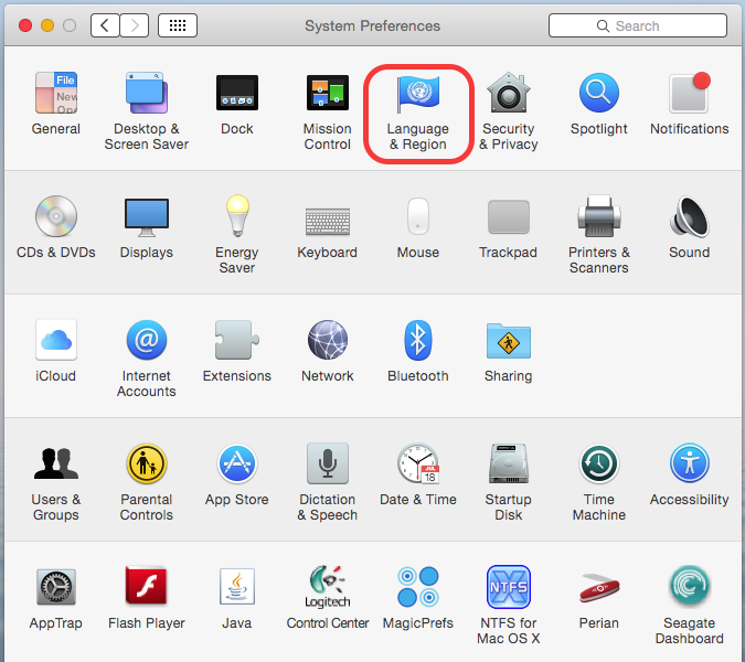
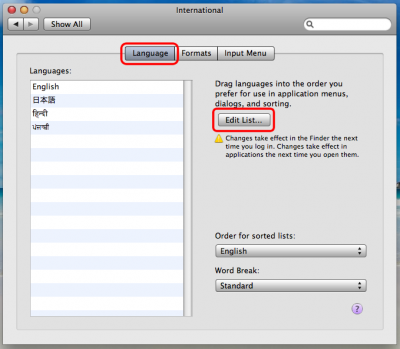
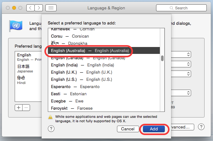
 Step 3: Select the language desired – in this case English (Australia) and click Add:
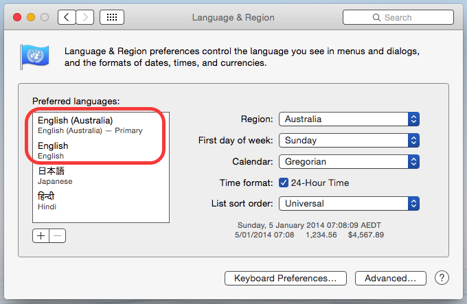
 This is what it should look like:
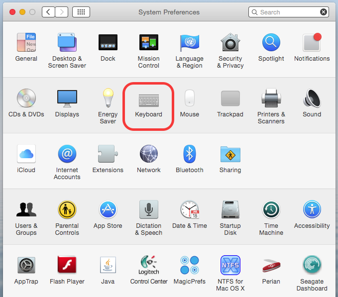
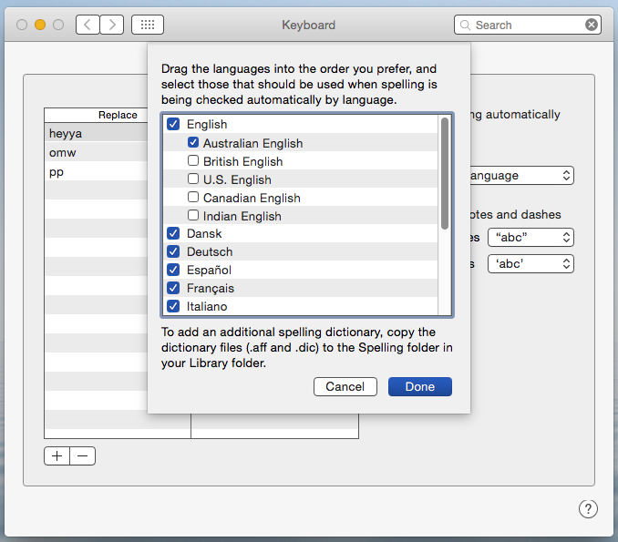
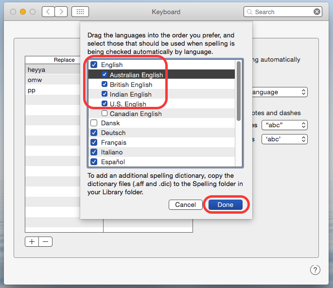
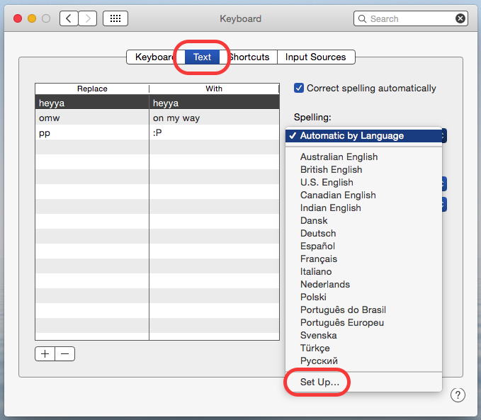 In the setup window, you can pick which dictionaries apply – so if you’re not going to type in Russian or Polish, for instance, you can remove these: