Just thought I’d show three of the designs that (nearly) made it.
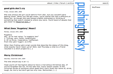
This first one went through three revisions itself – pushing the sky on the left? horizontal? on the right? – before I found the genius idea of putting it between the content and the sidebar. And then I looked at it and thought, “wow, that’s so…. white….” and I really couldn’t figure out where to put the colours into it. Interesting design exercise, though.
For some reason, I called the design above “ubermorgen” (“very morning” in German). I have no idea why.
This one was a lot more straightforward naming – “b+w”, and was one of those ideas that sounds really quite good in my head, but just doesn’t translate to paper (or screen, as it were). Again, my issue here became that if I introduced any colour, it would throw things off. I liked the little stripes I had going there though, as well as the translucent sidebar. Maybe in another life.
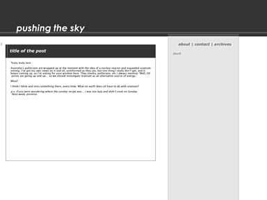
This, I think, was just about the shortest-lived design I had, as evidenced by the lack of any lorem ipsum in the content. I called it “Vert”, as the whole thing just seemed to want to scroll (maybe I should’ve called it “scroll”?). Again, an idea that worked really well in my head, but just didn’t quite pan out when I played around with it. It was all well and good to have the Really Big Textâ„¢ on the home page, but when you got to the content, it was a distraction, big and bold – so the title would have to translate to a smaller, horizontal one, and then you lost the branding impact.
And finally…
 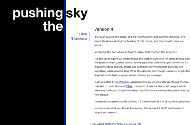
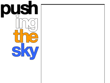
Out of the ashes of “Vert” was “Stripe” born. I played with the design a little, giving the giant header a black background like you see on the side of this design. And then, to make the colours mesh, I had to play around a little… and then the blue stripe emerged out of somewhere, and suddenly we were cruising, or at least on a path I liked. I dropped the orange in the title in favour of simplifying to a 3 colour primary palette, letting the brand define itself. Et voila, pushing the sky, version 4.